
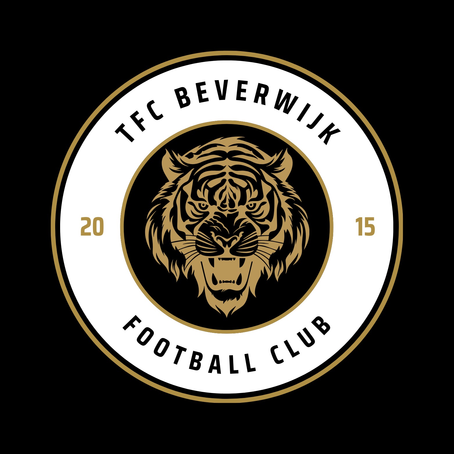
The logo for TFC Beverwijk is a bold representation of strength, energy, and community spirit. Centered around a fierce tiger head, the design symbolizes determination and power—qualities that reflect the team's identity.
The year 2015, marking the club's establishment, is subtly integrated into the design, adding a sense of pride and history. The clean, modern typography of "TFC Beverwijk" balances the dynamic tiger illustration, creating a professional and cohesive emblem.
With a striking color palette of black, orange, and white, the logo is vibrant and eye-catching, making it perfect for a sports organization that thrives on passion and teamwork. This design embodies TFC Beverwijk’s bold spirit and their commitment to excellence.
- Categories
- Branding